15 Stunning Dining Room Wall Decor Ideas to Transform Your Space
Your dining room walls are staring at you. Blank. Boring. Begging for attention. We’ve all been there, walking past that empty wall space and thinking “I should really do something about that” before getting distracted by literally anything else.
Well, today’s the day we tackle those walls head-on. I’ve spent years experimenting with different wall decor styles (and making plenty of mistakes along the way), and I’m here to share what actually works. These aren’t just pretty Pinterest ideas that look good in photos but fall flat in real life – these are practical, achievable designs that’ll make your dining room the star of your home.
Ready to turn that snooze-fest of a dining room into something that’ll make your guests actually put their phones down during dinner? Let’s get started.
Minimalist Floating Shelf Gallery
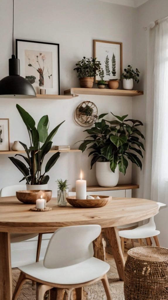
Remember when everyone thought minimalism meant having nothing on your walls? Yeah, we’ve moved past that thankfully. Floating shelves offer the perfect balance between clean lines and functional display space.
I installed three staggered floating shelves in my dining room last year, and honestly? Game-changer. The beauty lies in their versatility – you can switch up what you display based on seasons, holidays, or just when you get bored. Currently, mine showcase a rotating collection of small potted succulents, a few ceramic pieces I picked up in Portugal, and some minimalist art prints.
Setting Up Your Floating Shelf Display
The trick to nailing this look? Keep your color palette limited to 2-3 colors max. I stick with whites, natural wood tones, and one accent color (currently sage green). This creates cohesion without looking matchy-matchy.
Space your shelves irregularly – perfect symmetry actually looks weird in minimalist design. Trust me on this one. I learned this the hard way after spending an entire afternoon measuring and re-measuring for perfect spacing, only to realize it looked like a retail display.
Pro tip: Install your shelves at different depths if you really want to add visual interest. My longest shelf extends 12 inches from the wall, while the shortest is just 6 inches. This layered effect creates dimension without cluttering the space.
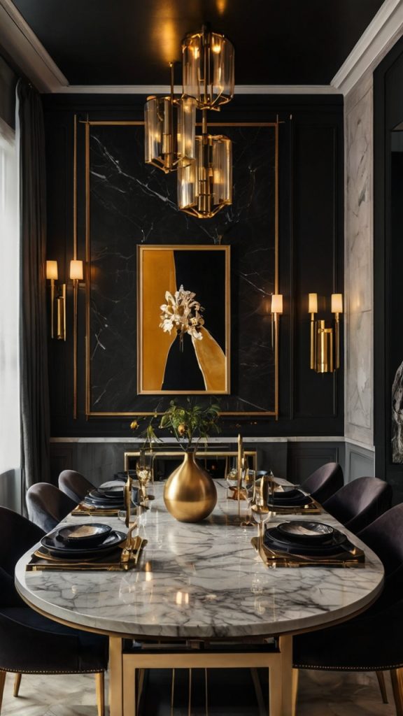
Oversized Abstract Canvas Art
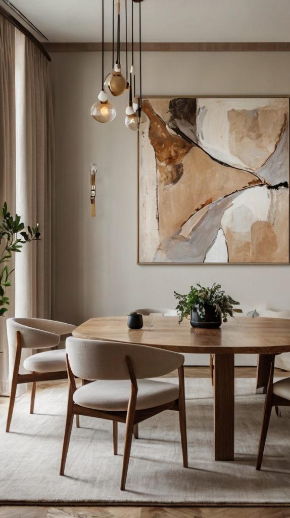
Want to make a statement without saying a word? An oversized abstract canvas does all the talking for you. And when I say oversized, I mean go big or go home – we’re talking at least 48 inches wide.
I’ll admit, I was intimidated by large-scale art at first. Won’t it overwhelm the room? Make everything else look tiny? Turns out, the opposite happens. Large art actually makes your dining room feel more spacious by creating a focal point that draws the eye upward and outward.
Choosing the Right Abstract Piece
Here’s where people mess up: they choose art that fights with their dining room instead of complementing it. Your abstract piece should pull colors from your existing decor, not introduce an entirely new palette. Look around your dining room right now. What colors do you see? Those should appear in your artwork.
Texture matters too. If your dining room features lots of smooth surfaces (glass table, leather chairs), consider a canvas with visible brushstrokes or mixed media elements. The contrast adds depth without requiring any additional decorating effort.
Don’t stress about matching your art to current trends. Abstract art has been around since the early 1900s – it’s not going anywhere. Choose something that makes you feel something, even if you can’t explain what that something is.
Rustic Wooden Accent Wall
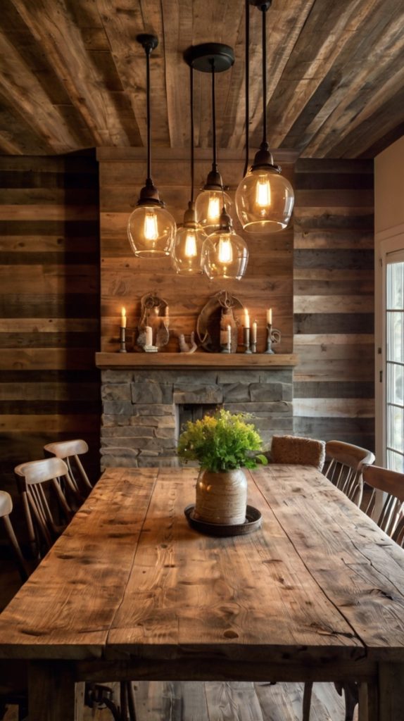
Okay, who else watched every home renovation show during 2020 and became obsessed with accent walls? Just me? Well, rustic wood accent walls have stuck around for good reason – they add warmth, texture, and character that paint alone can’t achieve.
I helped my sister install reclaimed barn wood on her dining room wall last summer, and let me tell you, the transformation was insane. The room went from “nice enough” to “wow, can I move in?” in a weekend.
DIY vs Professional Installation
Real talk: you can totally DIY this, but know your limits. If you’ve never used a level or can’t tell a stud finder from a hair dryer, maybe call in some help. There’s no shame in that game – I’ve learned that poorly installed wood panels look worse than bare walls.
The wood you choose matters immensely. Reclaimed wood brings authentic character with its natural weathering and imperfections. New wood can work too, but you’ll want to distress it yourself for that rustic vibe. FYI, beating wood with chains in your garage makes you look slightly unhinged to the neighbors, but the results are worth it 🙂
Consider the direction of your planks carefully. Horizontal planks make rooms feel wider, while vertical installation adds height. Diagonal? That’s for the bold among us – it creates dynamic movement but requires precise cutting.
Also Read: 15 Stunning Dining Room Lighting Ideas for Elegant Spaces
Botanical Wall Prints Set
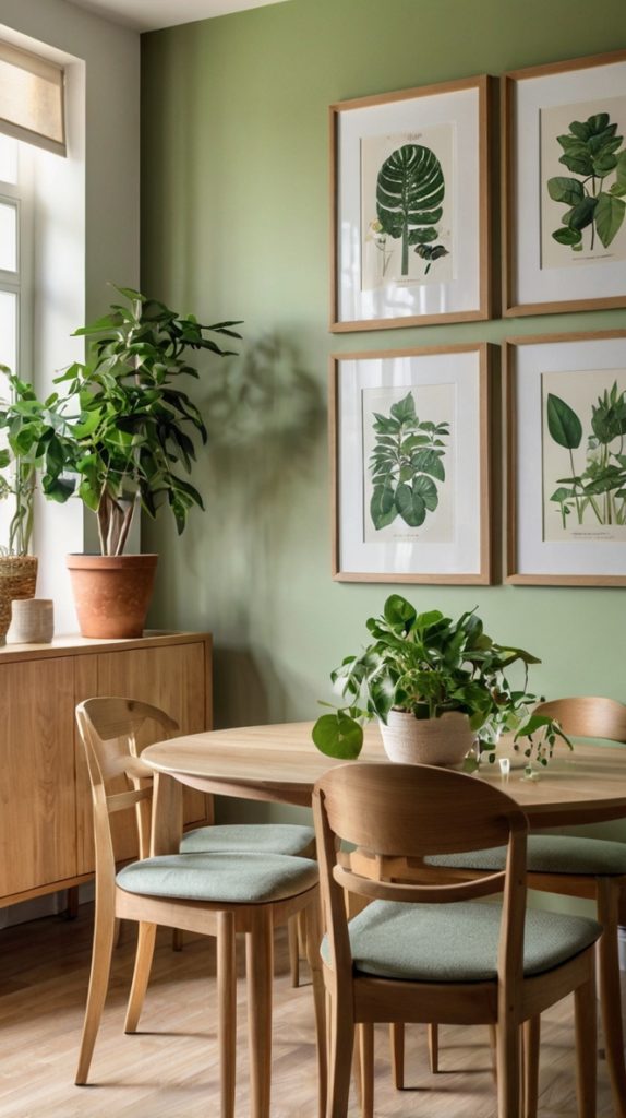
Plants everywhere might be trending, but botanical prints have been classy since forever. They bring nature indoors without the commitment of keeping actual plants alive (looking at you, serial plant killers – no judgment here).
My dining room features a set of six vintage-style botanical prints, and they never fail to get compliments. The key to making botanical prints feel fresh rather than fusty? Modern framing and unexpected arrangements.
Creating Your Botanical Gallery
Skip the matching frames unless you’re going for a super formal look. I mix thin black frames with natural wood ones, and the variety actually makes the collection feel more curated and less “I bought this set at HomeGoods.”
Play with scale too. Don’t just stick to standard 8×10 prints. Mix in some larger pieces (16×20) with smaller ones (5×7) for visual rhythm. The varying sizes prevent that grid-like, doctor’s office waiting room vibe.
Here’s a secret: vintage botanical prints are ridiculously easy to find for free online. Museums and libraries have digitized thousands of them. Print them yourself on quality paper, and boom – you’ve got authentic vintage art for the cost of printing.
Geometric Metal Wall Sculptures
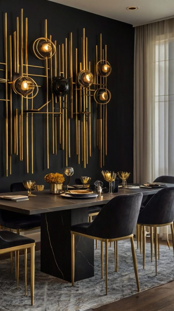
Metal wall art used to mean those terrible sun-faced monstrosities from the ’90s. Thank goodness we’ve evolved. Today’s geometric metal sculptures bring sophistication and edge to dining rooms without looking like yard sale rejects.
I scored an incredible copper geometric piece at an art fair last year, and it completely changed how light plays in my dining room. The shadows it casts throughout the day are almost as interesting as the sculpture itself.
Selecting and Placing Metal Art
Size and proportion matter here. Measure your wall space and aim for a sculpture that takes up about 2/3 of the available width. Too small and it looks lost; too large and it feels oppressive.
Metal finish should coordinate with your existing hardware. Got brushed nickel light fixtures? Stick with similar cool-toned metals. Brass or copper hardware pairs beautifully with warm-toned sculptures. Mixing warm and cool metals can work, but it requires confidence and usually a unifying element like black accents.
Placement height trips people up constantly. The center of your sculpture should sit at eye level when you’re seated at your dining table. This usually means hanging it lower than you think – around 56-60 inches from the floor to center.
Boho Macrame Wall Hanging
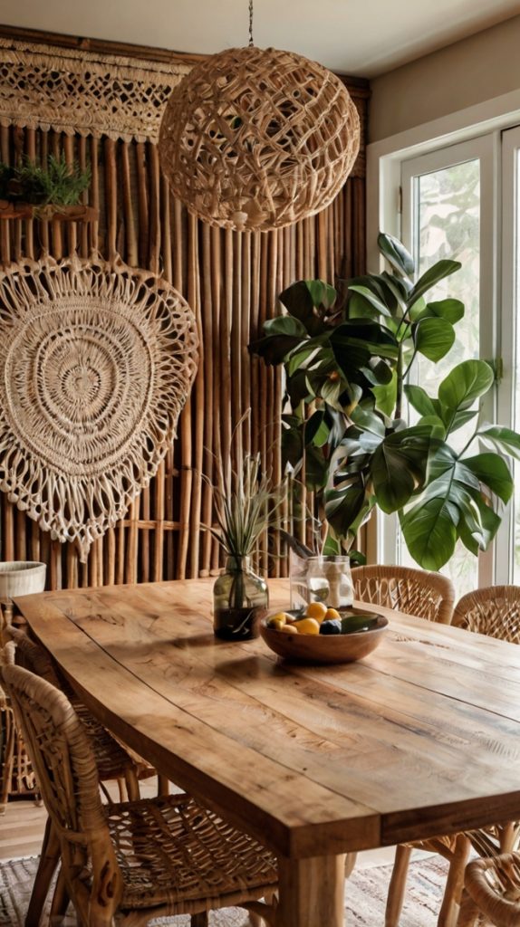
Yes, macrame is back from the ’70s, and no, that’s not a bad thing. Modern macrame wall hangings have evolved beyond those dusty plant holders your grandma had. Today’s versions bring texture and softness to dining rooms dominated by hard surfaces.
My friend swore she’d never do macrame (too hippy-dippy for her taste), but after seeing a stunning contemporary piece at a local restaurant, she changed her tune. Now her dining room features a massive macrame installation that looks more like textile art than craft project.
Making Macrame Work in Your Space
Scale is everything with macrame. Go larger than feels comfortable – these pieces compress visually from a distance, so what looks huge up close appears perfectly proportioned from your dining table.
Color doesn’t have to mean beige. While natural cotton creates that classic boho vibe, dyed macrame in deep blues, blacks, or even metallics can complement modern dining rooms beautifully. I’ve seen incredible pieces incorporating copper wire that bridge boho and industrial styles perfectly.
The wall behind your macrame matters too. Dark walls make light-colored macrame pop dramatically, while textured walls add another layer of visual interest. Just avoid hanging macrame over busy wallpaper – that’s visual chaos waiting to happen.
Also Read: 15 Stunning Modern Farmhouse Dining Room Ideas to Try
Vintage Mirror Arrangement
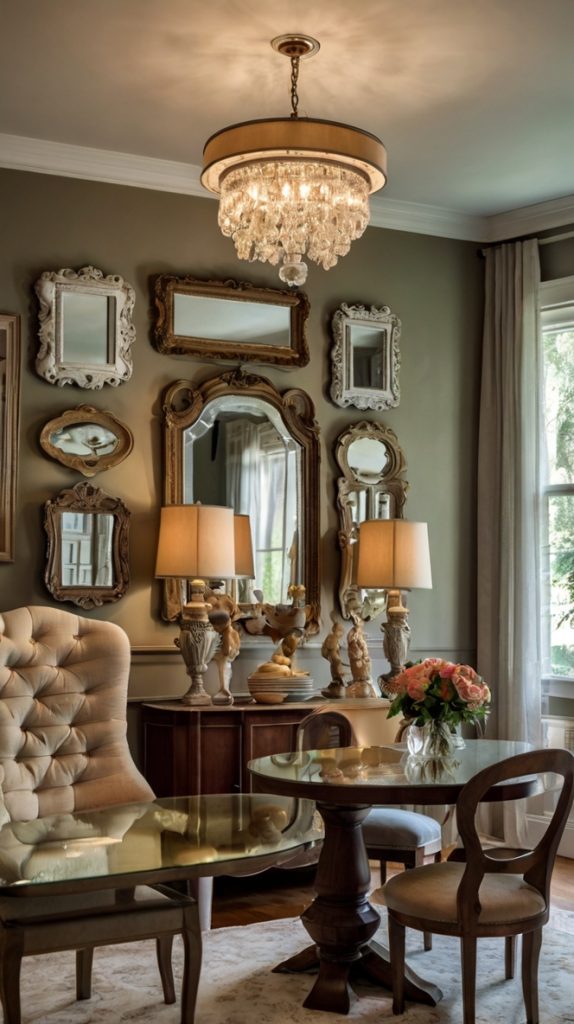
Mirrors in the dining room aren’t just about checking for spinach in your teeth (though that’s helpful). A well-planned vintage mirror arrangement reflects light, creates depth, and adds serious style points.
I collect vintage mirrors obsessively – estate sales, flea markets, random antique shops in small towns. My dining room wall currently displays seven mirrors of varying sizes and styles, and the effect never gets old. Every time light conditions change, the whole wall transforms.
Curating Your Mirror Collection
Here’s the thing about vintage mirrors: imperfections are features, not flaws. That slightly foxed glass? Character. The ornate frame with chipped gold leaf? Authenticity. These details tell stories that perfect new mirrors can’t match.
Arrange mirrors organically, not symmetrically. I start with my largest piece slightly off-center, then build around it like I’m solving a puzzle. Leave breathing room between pieces – cramming them together defeats the purpose of reflection and creates visual clutter.
Mix shapes liberally. Combine round, rectangular, and unusual shapes like sunbursts or hexagons. The variety prevents monotony while maintaining cohesion through the reflective element. Just keep frame colors within the same family – all golds, all silvers, or all painted colors work best.
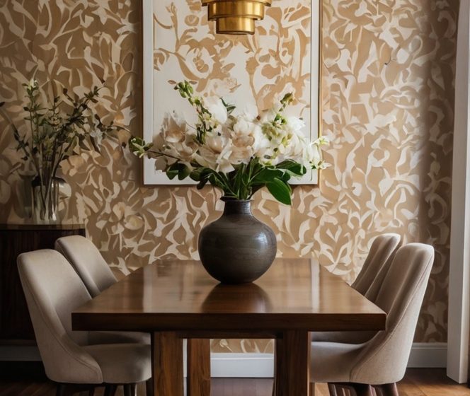
Textured Wallpaper Accent Panel
Who says you need to wallpaper an entire wall? Textured wallpaper panels offer maximum impact with minimum commitment (and expense). Plus, you can change them seasonally without losing your security deposit or sanity.
I discovered this trick accidentally when I had leftover grasscloth wallpaper from my bedroom project. Instead of returning it, I created a framed panel behind my dining room sideboard. The texture adds depth without overwhelming the space, and guests always want to touch it (go ahead, I won’t judge).
Creating Wallpaper Panels
The frame makes or breaks this look. Substantial molding creates the illusion of architectural detail, while thin frames look unfinished. I use 3-inch wide molding painted the same color as my walls for seamless integration.
Choose wallpaper with actual texture, not just printed patterns. Grasscloth, linen, cork, or even leather-look papers create dimension that flat papers can’t achieve. The tactile element engages multiple senses, making your dining room feel more layered and sophisticated.
Panel size should relate to your furniture. Above a sideboard? Make the panel 2/3 the width of the furniture piece. On an empty wall? Go larger – at least 48 inches wide to avoid looking like an afterthought.
Farmhouse Style Wall Clock Display
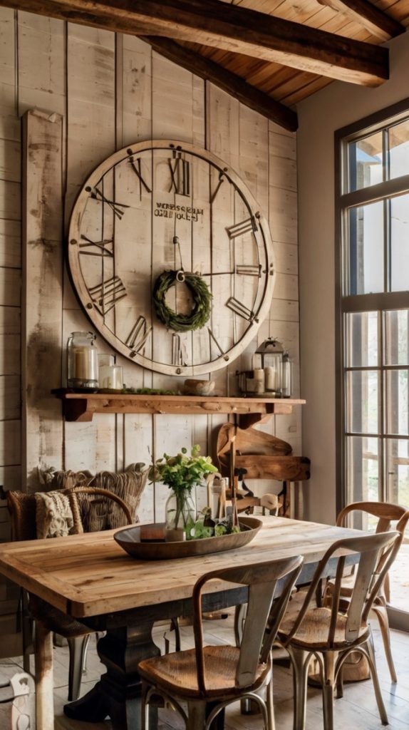
Forget those tiny clocks you can barely read from across the room. Oversized farmhouse clocks make a statement while actually serving a purpose (novel concept, right?).
My dining room features a 36-inch distressed wood clock that I scored at an antique mall for way less than those mass-produced versions. It anchors the space and gives guests something to stare at besides their phones during dinner.
Styling Your Clock Display
Size matters, but so does placement. Center your clock on the wall both horizontally and vertically – this is one place where symmetry actually works. The clock face should sit at standing eye level, usually around 66-70 inches from the floor to center.
Don’t let your clock float alone on the wall. Flank it with smaller decorative elements like sconces, small shelves, or botanical prints. This creates a vignette rather than a lonely clock on an empty wall. Just maintain breathing room – crowding your clock defeats its statement-making purpose.
Consider functionality alongside style. Can you actually read the numbers from your dining table? Those gorgeous clocks with Roman numerals look amazing but prove useless when you’re trying to figure out if dessert timing works with bedtime. IMO, style should never completely trump function in living spaces.
Also Read: 15 Stunning Round Table Dining Room Ideas to Try Today
Framed Family Recipe Wall
Want decor that starts conversations? Frame your family recipes. Not photocopies – the actual handwritten cards with butter stains and fading ink. These pieces tell stories that no store-bought art can match.
I framed my grandmother’s handwritten pierogi recipe (complete with her margin notes like “more butter always!”), and it generates more discussion than any other piece in my dining room. Food brings people together, and displaying recipes celebrates that connection.
Creating Your Recipe Gallery
Handle those original recipes carefully. Use archival materials – acid-free mats, UV-protective glass – to preserve them. Yes, it costs more, but these are irreplaceable family treasures. Make high-quality copies for actual cooking use.
Mix recipes with related elements for visual interest. Include old family photos from dinner gatherings, vintage kitchen tools, or even pressed herbs used in the recipes. This creates narrative depth beyond just framed papers.
Arrange recipes chronologically or by course to add structure. I organized mine from appetizers to desserts, creating a visual menu on my wall. Consistent framing (same color, varying sizes) maintains cohesion while allowing each recipe’s personality to shine.
Modern Plate Wall Art
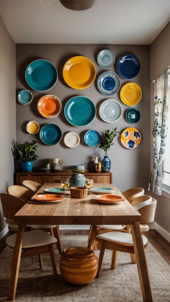
Plates on walls might sound like your grandmother’s house, but modern plate arrangements have nothing to do with those fussy china displays. Today’s plate walls feature bold patterns, unexpected colors, and artistic arrangements that feel more gallery than granny.
My plate wall started with three random plates from a Turkish bazaar. Now it’s grown to fifteen pieces collected from travels and local artists. Each plate tells a story, and together they create a dynamic, three-dimensional art installation.
Designing Your Plate Display
Forget matched sets unless you’re going for intentional uniformity. Mix patterns, colors, and sizes liberally. The unifying element? Shape – they’re all circular, creating harmony despite their differences.
Paper templates save walls and sanity. Cut paper circles matching your plate sizes and arrange them on the floor first. When you like the layout, tape templates to the wall and adjust before committing to nail holes. This method has saved me from countless spacing disasters.
Include non-traditional pieces for interest. Woven baskets, ceramic tiles, or even vinyl records (for music lovers) add unexpected elements while maintaining the circular theme. Just ensure everything can hang securely – nobody wants broken plates with their bruschetta.
Woven Basket Wall Display
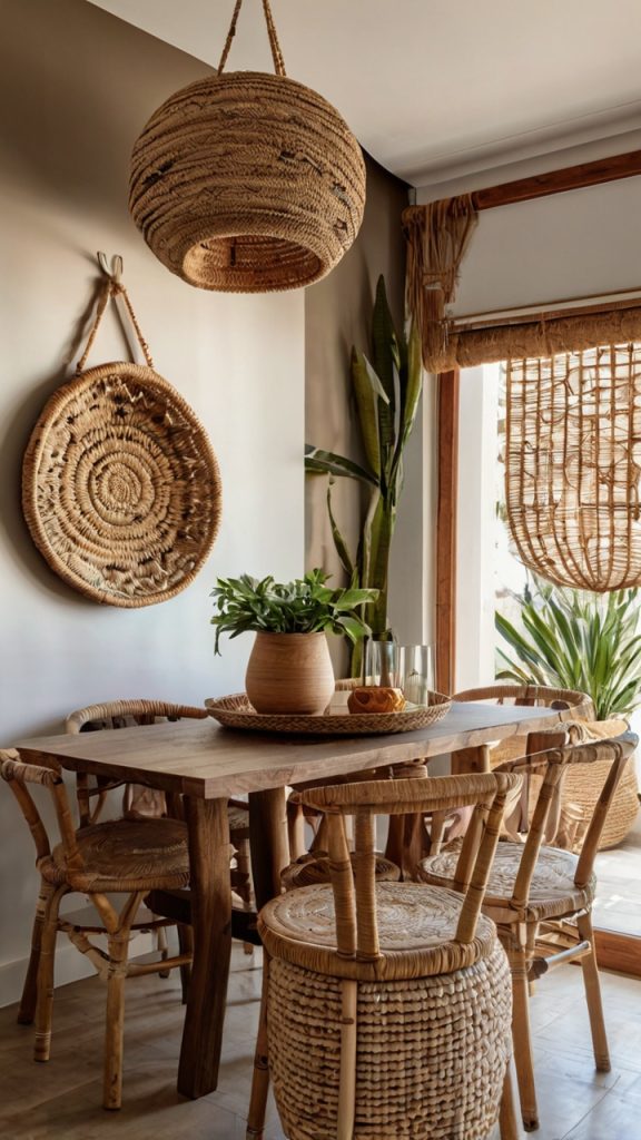
Baskets aren’t just for storage anymore. Woven basket walls bring incredible texture and warmth to dining rooms, especially those with minimal architectural detail. Plus, they’re budget-friendly compared to traditional art.
I started my basket wall with three pieces from a local craft fair and built from there. Now it features twelve baskets from various countries and cultures, creating a global textile gallery that costs less than a single piece of comparable-sized artwork.
Building Your Basket Collection
Vary your textures and weaving patterns. Combine tight weaves with open patterns, smooth finishes with rough textures. This variety creates visual rhythm that keeps the eye moving across the display.
Color coordination prevents chaos. While mixing natural tones works beautifully, introducing one accent color throughout several baskets creates intentional design rather than random accumulation. I use indigo-dyed baskets as my accent, scattered strategically through the neutral pieces.
Hanging method matters for preservation. Use plate hangers or picture ledges rather than nailing through the baskets themselves. This protects the integrity of the weaving and allows easy rearrangement when you inevitably find another amazing basket you can’t resist.
Statement Wall Sconces Pair
Lighting shouldn’t just illuminate – it should decorate. Statement sconces flanking artwork or mirrors add symmetry, drama, and ambiance that overhead lighting can’t achieve.
I installed oversized brass sconces on either side of my dining room mirror, and the difference floored me. The layered lighting creates intimacy during dinners while highlighting my wall decor beautifully. Why did I wait so long?
Selecting and Installing Sconces
Scale bigger than feels natural. Oversized sconces make bold statements without overwhelming when properly spaced. Mine extend 14 inches from the wall – dramatic but proportional to my dining room’s scale.
Height placement requires precision. Install sconces 60-66 inches from floor to center for optimal light distribution and visual balance. This height works whether you’re seated or standing, avoiding awkward shadows or glare.
Consider hardwiring versus plug-in options honestly. While hardwired sconces look cleaner, plug-in versions with decorative cord covers offer flexibility and easier installation. No shame in choosing convenience – I have both types, and guests never notice the difference.
Personalized Neon Word Sign
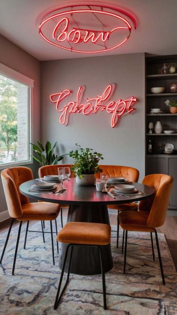
Neon signs left dive bars and entered dining rooms, and honestly? About time. Custom neon word signs add personality and modern edge that traditional art can’t match. Plus, they’re conversation starters guaranteed.
My dining room features “Gather” in warm white neon ��� basic? Maybe. But it sets the tone for our space and looks incredible against our dark accent wall. The soft glow during evening dinners creates ambiance better than any candle arrangement.
Designing Your Neon Display
Choose words that resonate personally. Skip generic phrases unless they genuinely mean something to you. Inside jokes, family mottos, or meaningful quotes create authentic connections. My friend has “More Butter” in her dining room – a tribute to her grandmother’s cooking philosophy.
Color temperature affects mood dramatically. Warm white or amber creates cozy ambiance, while cool white feels modern and crisp. Colored neon makes bold statements but requires careful coordination with existing decor. Pink neon might seem fun until it clashes with everything else.
Size and placement need careful consideration. Neon commands attention, so position it thoughtfully. Above a sideboard, centered on an accent wall, or integrated into a gallery wall all work. Just ensure it’s secured properly – these signs are surprisingly delicate despite their tough appearance.
Gallery Wall of Travel Photography
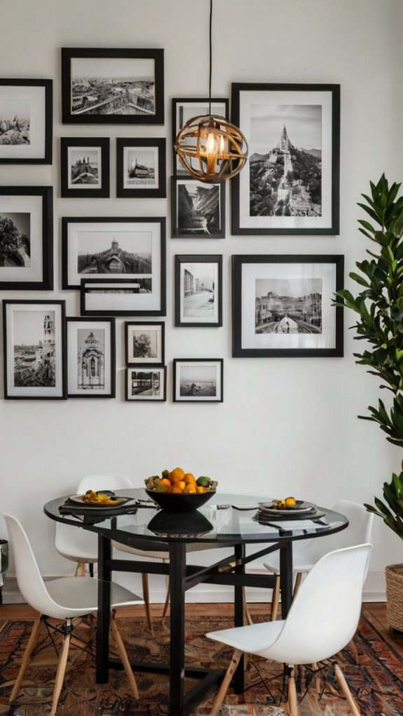
Your travel photos shouldn’t live only on your phone. A travel photography gallery wall brings adventures into daily life while creating deeply personal dining room decor.
My gallery wall features twenty photos from various trips, professionally printed and thoughtfully arranged. Every meal becomes a mini-vacation as we reminisce about Turkish sunsets, Italian markets, and Norwegian fjords.
Curating Your Travel Gallery
Print quality changes everything. Those phone pics look great on screens but terrible enlarged. Professional printing on quality paper transforms snapshots into art. I use a mix of matte and metallic papers depending on each photo’s mood.
Create cohesion through editing. Consistent color grading unifies photos from different trips and times. I edit all mine with slightly warm, desaturated tones for a cohesive vintage travel poster vibe. This prevents the rainbow effect of mixing unedited photos.
Tell stories through arrangement. Group photos by trip, theme, or color rather than random placement. My arrangement flows geographically from left to right – European shots transitioning to Asian adventures. This creates narrative flow that engages viewers longer than scattered placement would.
Mix photo sizes dramatically. Combine large statement pieces (16×20 or bigger) with smaller supporting images. This hierarchy guides the eye and creates visual interest that same-sized prints can’t achieve. Include some panoramic prints for unexpected horizontal movement.
Conclusion
There you have it – fifteen ways to transform those boring dining room walls into something spectacular. The best part? None of these ideas require massive renovation or lottery-winning budgets. Start with one concept that speaks to you and build from there.
Remember, your dining room should reflect your personality, not some magazine’s idea of perfection. Mix ideas, break rules, make mistakes. The walls that get the most compliments in my home are usually the ones I stressed about least.
Whether you go minimal with floating shelves or maximal with a travel photo gallery, the key is starting. Pick one idea from this list, set aside a weekend, and make it happen. Your dining room walls have waited long enough for their glow-up. Time to give them the attention they deserve – your dinner guests will thank you, and more importantly, you’ll actually enjoy spending time in your dining room again.
Now stop reading and start decorating. Those walls won’t transform themselves, and that perfect dining room vibe you’re dreaming about? It’s just a few nail holes away.