15 Beautiful Hallway Paint Colors Ideas to Brighten Your Space
Let’s face it – hallways get the short end of the stick when it comes to home design. We walk through them a million times a day, yet somehow they’re always the last space we think about decorating. Well, I’m here to change that mindset because the right hallway paint color can completely transform your home’s entire vibe.
I learned this the hard way after living with builder-grade beige walls for three years. One weekend, armed with a paintbrush and too much confidence, I transformed my narrow hallway into something that actually made me smile. Trust me, picking the perfect hallway color matters more than you think – it’s literally the thread that connects every room in your house.
Why Your Hallway Color Choice Actually Matters
Think about it: your hallway sees more action than any other space in your home. It’s where you dash through in the morning, where guests form their first impressions, and where your kids’ backpacks inevitably end up (despite having a designated spot). A thoughtfully chosen paint color can make narrow hallways feel wider, dark corridors brighter, and boring passages Instagram-worthy.
The trick? Understanding that hallways have unique challenges:
- Limited natural light (unless you’re blessed with skylights)
- High traffic means scuff marks and fingerprints
- Odd proportions that need visual balancing
- Multiple doorways creating choppy wall spaces
Now that we’ve covered why this matters, let’s jump into the good stuff – the colors that’ll make your hallway sing.
1. Soft Gray Elegance

Gray might sound boring, but hear me out. Soft gray creates this incredibly sophisticated backdrop that works with literally everything. I painted my upstairs hallway in Benjamin Moore’s “Cloud Cover,” and suddenly all my mismatched artwork looked intentionally curated.
What makes soft gray perfect for hallways? It reflects light beautifully without being as stark as white. Plus, it hides those inevitable scuff marks way better than lighter shades. Consider these winning gray tones:
- Sherwin Williams “Repose Gray” – warm undertones prevent that cold, prison-like feel
- Farrow & Ball “Pavilion Gray” – if you’re feeling fancy (and have the budget)
- Behr “Silver Drop” – budget-friendly but still gorgeous
Pro tip: Pair soft gray walls with crisp white trim for that classic, expensive look. Add a runner rug with some pattern, and boom – instant elegance.
2. Warm Taupe Comfort

Taupe gets a bad rap for being the ultimate “safe” choice, but there’s something comforting about walking through a hallway that feels like a warm hug. Warm taupe creates this cozy, grounded feeling that makes transitioning between rooms feel natural.
I’ve seen taupe work magic in homes with lots of wood floors and traditional furnishings. The key? Choose a taupe with enough warmth to avoid that dreaded “greige” territory. Some stellar options:
- Benjamin Moore “Revere Pewter” – the designer favorite for good reason
- Sherwin Williams “Balanced Beige” – perfect if your hallway connects to warmer rooms
- Clare “Current Mood” – modern take on traditional taupe
Making Taupe Work in Different Lighting
North-facing hallways? Go warmer with your taupe selection. South-facing with lots of light? You can handle cooler undertones. Remember, paint colors shift dramatically based on lighting conditions – always test patches at different times of day.
3. Pastel Blue Serenity
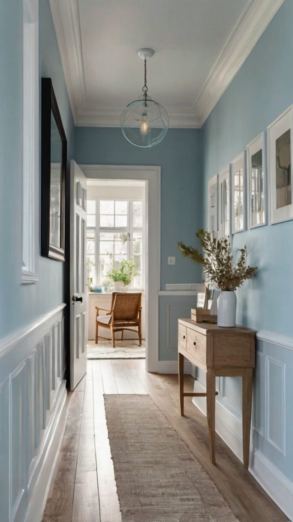
Want your hallway to feel like a breath of fresh air? Pastel blue delivers that spa-like serenity we’re all craving. I painted a client’s windowless hallway in a soft powder blue, and suddenly the space felt twice as airy.
Light blues work especially well in hallways because they create psychological space. Your brain associates blue with sky and openness – clever, right? Consider these dreamy shades:
- Farrow & Ball “Borrowed Light” – barely there blue that whispers elegance
- Benjamin Moore “Healing Aloe” – green-blue that’s surprisingly versatile
- Sherwin Williams “Watery” – perfect middle ground between bold and subtle
Ever wondered why beach houses always feel so relaxing? It’s that blue magic at work. Bring that vacation vibe home by pairing pastel blue walls with natural wood accents and white trim.
Also Read; 15 Brilliant Hallway Light Fixtures Ideas and Cozy Designs
4. Sage Green Freshness

Sage green has officially graduated from trendy to timeless, and hallways are the perfect place to embrace this earthy hue. This color brings the outdoors in while maintaining sophistication – think English countryside meets modern living.
What I love about sage green? It plays beautifully with both warm and cool color palettes. Your bedroom’s navy? Perfect match. Living room’s terracotta? Also works. Some winning sage selections:
- Benjamin Moore “October Mist” – 2022’s color of the year for good reason
- Clare “Avocado Toast” (yes, really) – millennial-approved freshness
- Sherwin Williams “Clary Sage” – deeper option for dramatic effect
Styling Tips for Sage Hallways
Layer in natural textures like jute runners, wooden console tables, and brass hardware. Sage green hallways practically beg for plants – hang some pothos or place a fiddle leaf fig in the corner. Trust me, the Instagram photos write themselves.
5. Crisp White Brightness
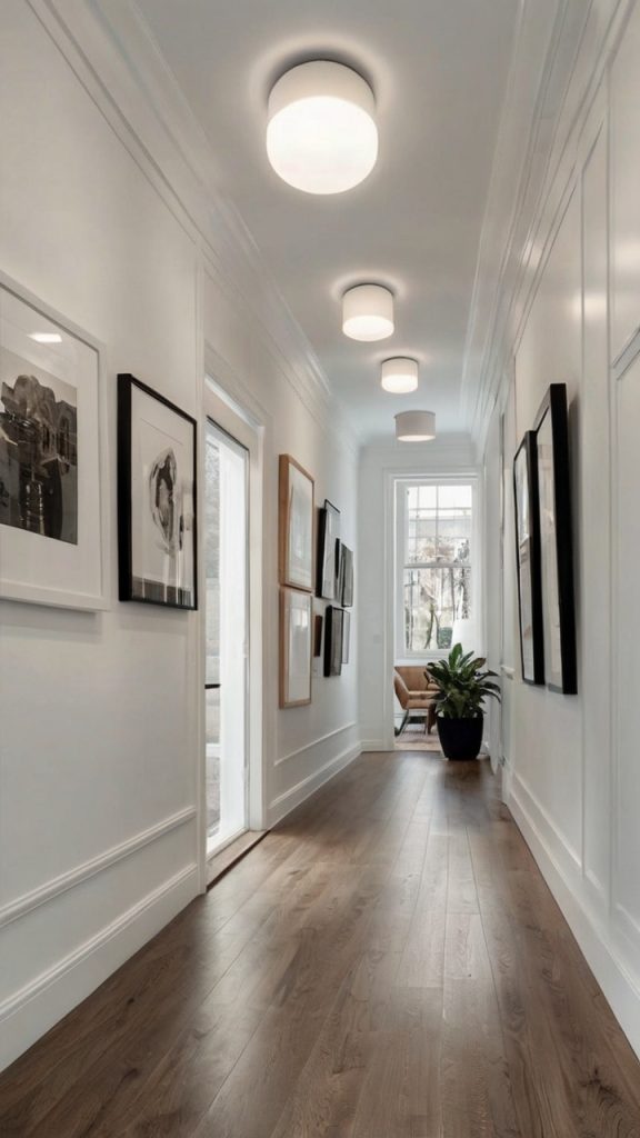
Before you scroll past thinking white’s too basic – stop right there. The right white paint can transform a dark hallway into a bright, gallery-like space. But here’s the catch: choosing white paint might be the hardest decision you’ll make (seriously, there are like 500 shades).
My first apartment had the narrowest hallway known to mankind. Painting it bright white instantly doubled the visual space. Key whites to consider:
- Benjamin Moore “White Dove” – warm enough to avoid hospital vibes
- Sherwin Williams “Pure White” – clean and modern
- Farrow & Ball “All White” – despite the name, has subtle warmth
The White Wall Strategy
White hallways need personality through other elements:
- Bold artwork pops against white walls
- Colorful runners add warmth and pattern
- Statement lighting becomes the focal point
- Architectural details like molding shine
FYI, white shows everything – every scuff, every fingerprint, every imperfection. But with the right finish (go for eggshell or satin), maintenance becomes manageable.
6. Moody Charcoal Drama

Ready to make a statement? Charcoal gray transforms hallways from forgotten passages into dramatic galleries. I know what you’re thinking – won’t dark paint make my hallway feel like a cave? Not if you do it right.
The secret? Embrace the drama rather than fight it. Dark hallways create this cocoon-like feeling that makes bright rooms feel even more spectacular by contrast. Top charcoal choices:
- Benjamin Moore “Wrought Iron” – sophisticated without being harsh
- Sherwin Williams “Peppercorn” – soft black that’s surprisingly livable
- Clare “Dirty Martini” – rich gray-green undertone adds depth
Making Dark Colors Work
Here’s what I learned painting my own hallway charcoal:
- Lighting is everything – invest in good fixtures or track lighting
- Keep ceilings white to maintain height
- Add mirrors to bounce light around
- Choose light-colored floors or runners for balance
The result? A hallway that feels intentional, sophisticated, and anything but boring.
Also Read: 15 Creative Upstairs Hallway Ideas to Inspire Your Decor
7. Sunny Yellow Cheer

Yellow hallways might sound crazy, but hear me out. A soft, buttery yellow brings instant warmth and happiness to transitional spaces. It’s like permanent sunshine, even on dreary days.
I helped my neighbor choose a pale yellow for her north-facing hallway, and the transformation was incredible. What seemed dark and unwelcoming became the cheeriest spot in her house. Consider these sunny shades:
- Benjamin Moore “Hawthorne Yellow” – sophisticated, not kindergarten
- Farrow & Ball “Dayroom Yellow” – muted elegance
- Sherwin Williams “Buttercup” – bold but balanced
Yellow Without the Yikes
The trick with yellow? Go lighter than you think you need. Yellow intensifies on walls, especially in enclosed spaces. Test multiple shades and observe them throughout the day – morning light versus evening light makes a huge difference.
8. Blush Pink Warmth

Pink in a hallway? Absolutely. Blush pink creates this incredibly sophisticated, warm atmosphere that feels both modern and timeless. We’re not talking Barbie pink here – think subtle, grown-up hues that whisper rather than shout.
My friend painted her hallway in a dusty blush, and everyone who visits asks for the paint color. It’s that perfect balance of unexpected yet totally livable. Top pink picks:
- Benjamin Moore “First Light” – 2020’s color of the year, still stunning
- Clare “Pêche” – peachy pink perfection
- Sherwin Williams “Intimate White” – barely-there pink for the cautious
Pink hallways work especially well with:
- Brass or gold hardware for warmth
- Black accents for modern contrast
- Natural wood for organic balance
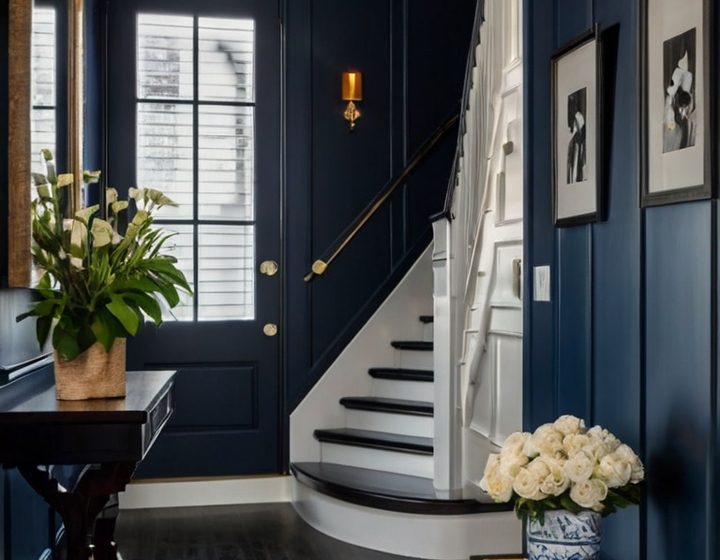
9. Deep Navy Sophistication
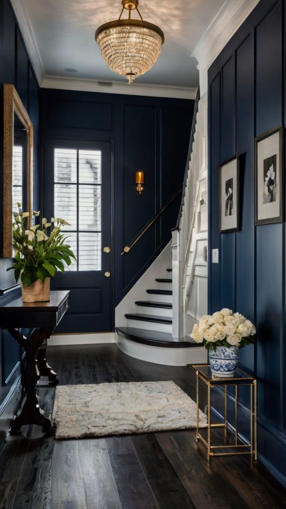
Navy blue in a hallway creates this incredible sense of depth and luxury. It’s bold without being aggressive, sophisticated without being stuffy. Think of it as the little black dress of paint colors – always appropriate, always chic.
I’ve seen navy work magic in both traditional and modern homes. The color has this chameleon quality that adapts to its surroundings. Stellar navy options:
- Benjamin Moore “Hale Navy” – the gold standard
- Sherwin Williams “Naval” – 2020’s color of the year, timeless choice
- Farrow & Ball “Hague Blue” – rich and dramatic
Navy Know-How
Navy hallways need strategic planning:
- White or light trim creates crisp contrast
- Metallic accents (gold, brass, silver) add glamour
- Good lighting prevents cave syndrome
- Light flooring maintains balance
The payoff? A hallway that looks like it belongs in a design magazine.
Also Read: 15 Amazing School Hallway Ideas and Creative Student Displays
10. Terracotta Earthy Vibes

Terracotta brings this amazing warmth that makes hallways feel grounded and welcoming. It’s like bringing the desert sunset indoors – warm, earthy, and surprisingly versatile.
This color trend exploded recently, and honestly, I get why. Terracotta works with so many styles – boho, modern, traditional, you name it. Consider these earthy options:
- Sherwin Williams “Cavern Clay” – 2019’s color that’s still going strong
- Benjamin Moore “Sedona Clay” – rich without being overwhelming
- Clare “CAT” (Current Mood) – modern take on traditional terracotta
Working with Warm Tones
Terracotta hallways love:
- Natural materials like wood and rattan
- White or cream trim for definition
- Plants (seriously, greenery pops against terracotta)
- Neutral furnishings to let walls star
11. Lavender Calm Retreat
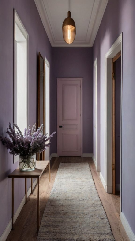
Soft lavender might seem unconventional, but this color creates an incredibly calming transition space. It’s unexpected enough to be interesting but subtle enough for daily living 🙂
I’ll admit, I was skeptical about purple-toned walls until I saw lavender in action. The right shade feels sophisticated, not saccharine. Top lavender loves:
- Benjamin Moore “Beach Plum” – gray-purple perfection
- Sherwin Williams “Vesper Violet” – soft and dreamy
- Farrow & Ball “Brassica” – muted purple with gray undertones
Lavender Styling Secrets
Here’s how to nail the lavender look:
- Keep other elements neutral – let lavender be the star
- Add metallic accents for glamour
- Include plenty of white to maintain airiness
- Layer in textures for depth
12. Mint Green Refresh

Mint green delivers this amazing fresh feeling that makes hallways feel clean and contemporary. It’s like a palette cleanser between rooms – refreshing without being cold.
IMO, mint works best in homes with lots of natural light, but I’ve seen it work magic in darker spaces too. The key? Choosing the right undertone. Great mint options:
- Benjamin Moore “Soft Mint” – true mint without being toothpaste-y
- Sherwin Williams “Green Trance” – subtle and sophisticated
- Clare “Matcha Latte” – trendy name, timeless color
13. Classic Beige Neutral

Before you roll your eyes at beige, consider this: the right beige creates a warm, welcoming hallway that never goes out of style. We’re talking elevated beige – complex, nuanced, interesting.
Beige gets a bad rap, but quality beige paints have depth and character. They’re also incredibly practical for high-traffic areas. Consider these upgraded beiges:
- Benjamin Moore “Shaker Beige” – warm without being yellow
- Sherwin Williams “Accessible Beige” – true neutral champion
- Farrow & Ball “String” – sophisticated and subtle
Beige Done Right
Make beige interesting by:
- Layering different textures in similar tones
- Adding black accents for contrast
- Including natural elements like wood and stone
- Playing with lighting to highlight undertones
14. Dusty Rose Subtle Charm

Dusty rose brings this beautiful, muted warmth that feels both vintage and modern. It’s romantic without being overly feminine, sophisticated without trying too hard.
This color works particularly well in hallways with traditional architecture – think crown molding and vintage doors. Top dusty rose picks:
- Benjamin Moore “Desert Rose” – perfect pink-beige balance
- Sherwin Williams “Malted Milk” – subtle and sophisticated
- Farrow & Ball “Setting Plaster” – the ultimate dusty pink
15. Bold Teal Statement

Ready to go bold? Teal creates an instant focal point that transforms boring hallways into memorable spaces. It’s vibrant without being overwhelming, especially when used strategically.
Teal works best when you commit fully – no half-measures here. The confidence pays off with a hallway that guests actually remember. Bold teal favorites:
- Benjamin Moore “Tucson Teal” – deep and dramatic
- Sherwin Williams “Oceanside” – perfect blue-green balance
- Clare “Blue Ivy” – modern and fresh
Making Bold Colors Sing
Success with bold colors requires:
- Quality paint and primer – no skimping here
- Proper lighting to show true color
- Neutral adjacent rooms for balance
- Confidence – own your choice!
Final Thoughts on Hallway Transformation
Here’s the thing about hallway paint colors – the “perfect” choice depends entirely on your home’s personality and your lifestyle. That moody charcoal that looks amazing in my friend’s Victorian might feel oppressive in your ranch-style home. The key? Understanding your space’s unique characteristics and choosing accordingly.
Remember, paint’s relatively cheap and totally changeable. If you hate it, you can always repaint (though proper prep and quality paint usually means you won’t have to). Take risks, trust your instincts, and don’t let anyone tell you that hallways don’t matter.
Your hallway’s waiting for its glow-up. Which color’s calling your name? Whatever you choose, just promise me you won’t leave those builder-grade beige walls for another year. Life’s too short for boring hallways :/