15 Stunning Green Backsplash Kitchen Ideas to Try Now

So you’re thinking about going green in the kitchen? Not talking about composting here (though kudos if you do that too). I’m talking about green backsplash tiles that’ll transform your cooking space from boring to absolutely brilliant.
Trust me, after renovating three kitchens in the last decade, I’ve learned that the right backsplash makes or breaks your entire design.
Green backsplashes have this magical ability to bring nature indoors while keeping things fresh and modern. Whether you’re a maximalist who loves bold statements or someone who prefers subtle elegance, there’s a green tile out there calling your name.
Let me walk you through 15 stunning green backsplash ideas that I’ve either installed myself or desperately wish I had room for in my own kitchen.
Emerald Green Subway Tile Backsplash
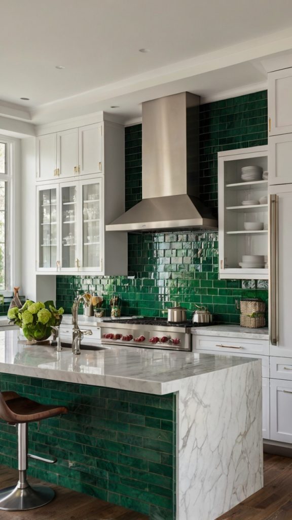
Let’s kick things off with a classic that never disappoints. Emerald green subway tiles bring serious drama to any kitchen without trying too hard. I installed these bad boys in my sister’s townhouse last summer, and honestly? The transformation was insane.
The beauty of emerald green lies in its versatility. Pair it with brass fixtures and you’ve got instant luxury. Go with matte black hardware? Now you’re cooking with modern sophistication. The rich, jewel-toned color catches light differently throughout the day, creating this dynamic visual experience that standard white tiles could never achieve.
What really sells me on emerald subway tiles is their ability to work with both light and dark cabinetry. White cabinets? The green pops like crazy. Dark wood? You get this moody, elegant vibe that feels straight out of a design magazine. Plus, the classic subway pattern means you won’t get tired of looking at it in five years.
Installation Tips That Actually Matter
Here’s what nobody tells you about installing these beauties:
- Use white grout for maximum contrast (trust me on this one)
- Consider a herringbone pattern if you want extra visual interest
- Seal the grout properly unless you enjoy scrubbing green stains
- Buy 10% extra tiles because accidents happen (learned this the hard way)
Mint Green Hexagon Tile Kitchen

Ever walk into a kitchen and immediately feel calmer? That’s the mint green hexagon effect. These tiles bring this fresh, airy quality that makes even the smallest kitchens feel more spacious. I’m slightly obsessed with how they look in morning light – it’s like having permanent spring vibes.
The hexagon shape adds geometric interest without overwhelming the space. Unlike traditional square tiles, hexagons create natural flow and movement. When you combine that shape with mint green’s soothing color? You get a backsplash that’s both trendy and timeless.
What makes mint hexagons particularly genius is their ability to bridge different design styles. They work beautifully in modern farmhouse settings, complement mid-century modern aesthetics, and even play nice with contemporary minimalist designs. The soft green tone acts as a neutral-ish backdrop that lets other design elements shine.
Forest Green Marble Effect Backsplash

Now we’re talking serious sophistication. Forest green marble-effect tiles give you all the luxury of natural stone without the maintenance nightmare. I recently helped a friend install these, and the depth of color literally made my jaw drop.
The veining in these tiles creates natural variation that keeps your backsplash from looking flat or boring. Each tile tells its own story, with swirls and patterns that catch your eye differently depending on where you stand. It’s like having artwork that happens to protect your walls from pasta sauce splatters.
Here’s the kicker – these tiles fool almost everyone. People constantly ask if it’s real marble, which, IMO, means mission accomplished. You get the high-end look without worrying about etching, staining, or remortgaging your house.
Why Choose Marble-Effect Over Real Marble
- Cost savings that’ll make your wallet happy
- Zero maintenance beyond normal cleaning
- More consistent coloring across tiles
- No sealing required (hallelujah!)
- Resistant to acids and stains
Also Read: 15 Amazing Green Kitchen Walls Ideas That Inspire Creativity
Olive Green Matte Finish Kitchen Tiles
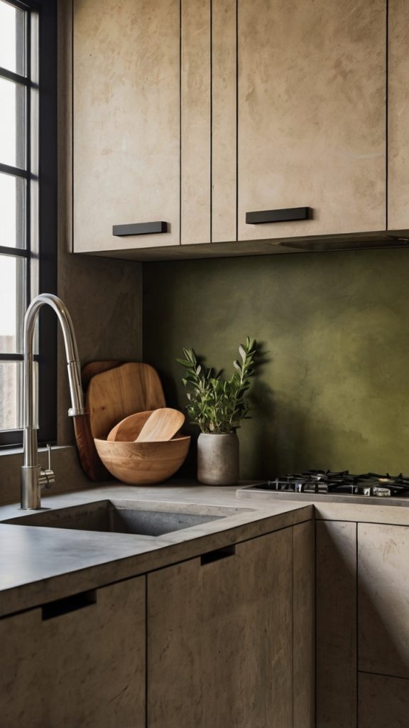
Can we talk about how olive green matte tiles make everything look expensive? There’s something about that muted, earthy tone that screams understated elegance. I installed these in my own kitchen last year, and guests always comment on how “grown-up” my space looks now.
The matte finish does double duty here. First, it eliminates glare, which means no squinting while you’re chopping vegetables. Second, it hides water spots and fingerprints better than glossy tiles ever could. For someone who cooks daily (and splashes liberally), this is a game-changer.
Olive green plays incredibly well with natural materials. Pair it with butcher block countertops? Chef’s kiss. Add some copper accents? Now you’re speaking my language. The color has enough gray undertones to feel neutral while still adding personality to your space.
Sage Green Textured Tile Kitchen Walls
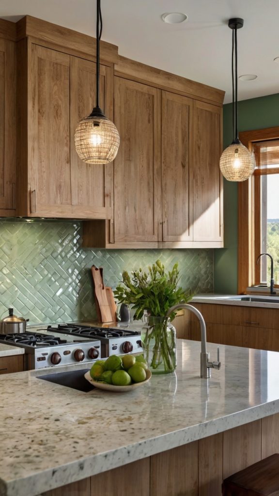
Textured sage green tiles bring dimension to your kitchen that flat tiles simply can’t match. Whether you go for subtle ripples or bold 3D patterns, texture adds that extra layer of visual interest that makes people stop and stare.
I first encountered textured sage tiles at a restaurant in Portland (because of course it was Portland), and I couldn’t stop running my hands over them. The way light plays across the surface throughout the day creates this ever-changing backdrop that keeps your kitchen feeling fresh and dynamic.
The sage color itself deserves a moment of appreciation. It’s not too bright, not too dull – just this perfect middle ground that works with literally every cabinet color I’ve tried. Sage green has this calming quality that makes even hectic morning routines feel a bit more zen.
Texture Options That Actually Work
- Wave patterns for subtle movement
- Geometric raised designs for modern appeal
- Handmade-look irregularities for artisan charm
- Linear grooves for contemporary elegance
Bright Lime Green Glass Backsplash
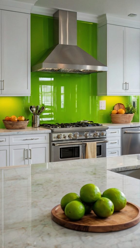
Feeling brave? Lime green glass tiles make a statement that nobody forgets. I’ll admit, when my neighbor first told me she was going lime green, I was skeptical. Then I saw the finished product and ate my words (they tasted like humble pie, FYI).
Glass tiles reflect light like nothing else, making your kitchen feel larger and brighter. The lime green color brings this electric energy that’s perfect for people who actually enjoy cooking. It’s impossible to feel sluggish when you’re surrounded by such vibrant color.
What surprises most people about bright lime backsplashes is how well they photograph. Your kitchen instantly becomes Instagram-worthy, and every meal prep session feels like a photoshoot opportunity. The glossy surface also makes cleaning ridiculously easy – just wipe and go.
Also Read: 15 Beautiful Olive Green Kitchen Ideas for Modern Homes
Dark Green Patterned Ceramic Tiles
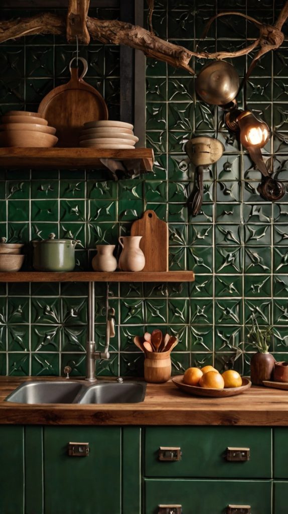
Ready for some serious personality? Dark green patterned ceramic tiles bring old-world charm with a modern twist. Think Moroccan-inspired designs, geometric patterns, or even floral motifs – all in rich, deep greens that command attention.
I helped install patterned tiles in a friend’s Victorian renovation, and the results were stunning. The patterns add visual interest without requiring any additional decoration. Your backsplash becomes the star of the show, eliminating the need for wall art or excessive styling.
The dark green color grounds these patterns beautifully. While the same designs in bright colors might feel overwhelming, deep green keeps things sophisticated and slightly mysterious. It’s like having a secret garden right behind your stove.
Green Gradient Ombre Backsplash

Talk about a showstopper! Ombre green tiles transition from light to dark (or vice versa) creating this gorgeous gradient effect that looks like it belongs in an art gallery. I’ve only installed one of these, but it remains my favorite project to date.
The gradient effect adds incredible depth to your kitchen walls. Starting with pale mint at the top and deepening to forest green at the bottom creates this grounding effect that makes your space feel intentionally designed. Every visitor asks about it – guaranteed conversation starter.
Creating an ombre effect requires planning, but the payoff is huge. You’re essentially painting with tiles, creating a custom piece of functional art that nobody else will have. The gradual color shift also helps tie together different green elements in your kitchen.
Planning Your Gradient
- Map out your color transition before ordering tiles
- Use at least 4-5 shades for smooth transition
- Consider horizontal vs vertical gradients
- Test your layout before applying adhesive
Green and White Checkerboard Tiles
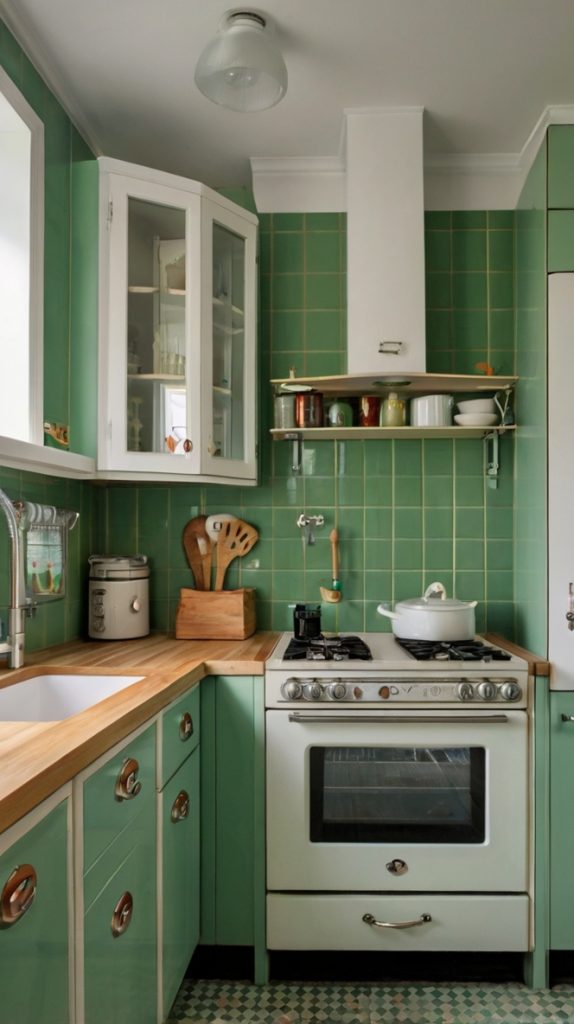
Who says checkerboard has to be black and white? Green and white checkerboard patterns bring retro charm without feeling dated. This design works especially well in vintage-inspired or eclectic kitchens where personality matters more than following trends.
I recently saw this pattern in a 1950s ranch renovation, and it completely transformed the space. The checkerboard creates rhythm and movement while the green keeps things fresh and unexpected. It’s playful without being childish, fun without being overwhelming.
The key to nailing this look lies in choosing the right shade of green. Too bright and it feels like a diner; too dark and you lose the cheerful vibe. Medium-toned greens like kelly or jade work perfectly, creating enough contrast with white while maintaining sophistication.
Also Read: 15 Gorgeous Dark Green Kitchen Ideas and Cozy Spaces
Vintage Green Subway Tile Kitchen

There’s something about vintage green subway tiles that makes me ridiculously happy. Maybe it’s the slight color variations between tiles, or the way they look like they’ve been there forever (even when brand new). These tiles bring instant character to any kitchen.
Vintage-style tiles often feature slightly irregular edges and surfaces that catch light differently. This imperfection is exactly what makes them perfect – your backsplash looks collected and curated rather than mass-produced. The subtle green tones typically lean toward celadon or seafoam, colors that feel both nostalgic and fresh.
I installed these in my mom’s kitchen, and she claims they make her coffee taste better. While I can’t verify that scientifically, I understand the sentiment. There’s something comforting about vintage green tiles that makes your kitchen feel like home.
Green Mosaic Tile Accent Wall
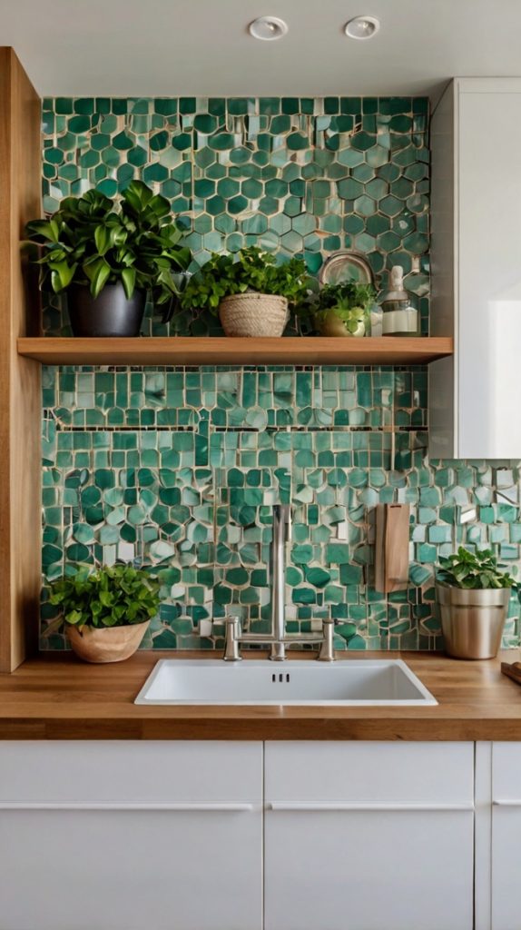
Want maximum impact? Green mosaic tiles deliver drama in spades. Whether you go for uniform small tiles or mixed sizes and shades, mosaics create texture and interest that draws the eye immediately.
Installing mosaics taught me patience (and maybe a few new curse words :)), but the finished product makes every minute worthwhile. The way thousands of tiny tiles work together to create one cohesive design feels almost magical. Each tile contributes to the bigger picture while maintaining its individual character.
Mixed green mosaics work particularly well because the color variations add depth without requiring different materials. You might have forest, emerald, and sage all playing together in perfect harmony. The result? A backsplash that looks different every time you glance at it.
Mosaic Installation Secrets
- Use mesh-backed sheets to maintain spacing
- Work in small sections to avoid adhesive drying
- Invest in quality grout – it makes a huge difference
- Consider professional installation for complex patterns
Deep Teal Green Kitchen Backsplash
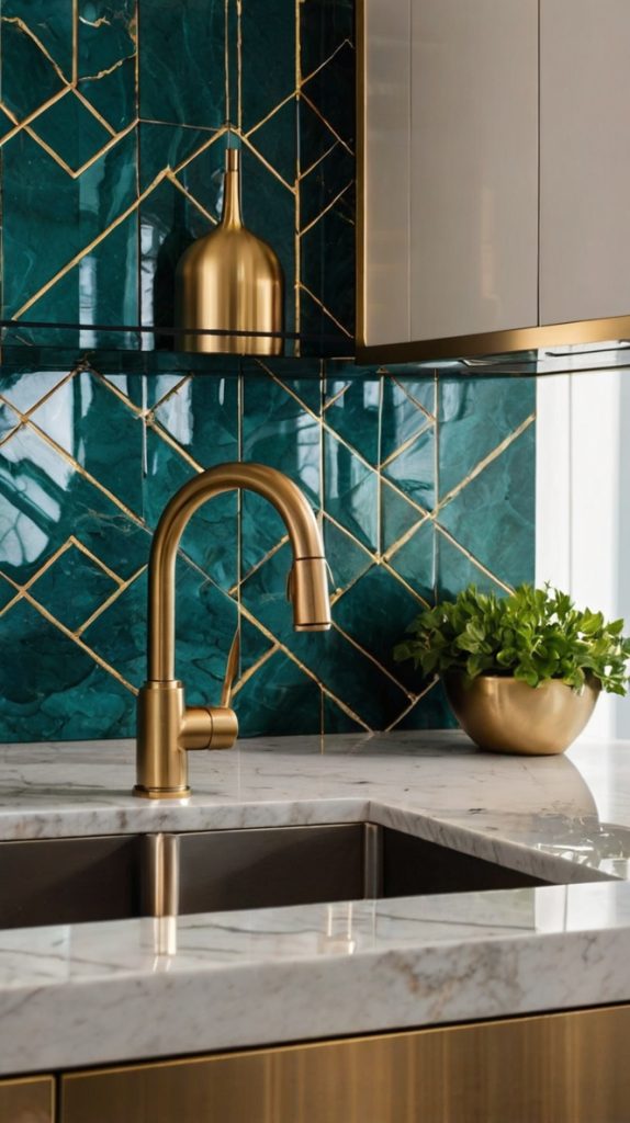
Straddling the line between green and blue, deep teal tiles bring oceanic vibes to your kitchen. This color works magic in spaces that need a bit of mystery and depth. I’m constantly amazed by how teal can feel both energizing and calming simultaneously.
The richness of deep teal makes it perfect for creating focal points. Install it behind your range, and suddenly your cooking area becomes the star of the kitchen. The color has enough blue to feel cool and calming, but enough green to maintain that natural, organic feeling we’re after.
What really sells me on teal is its chameleon-like quality. In bright light, it leans more turquoise. In evening light? It deepens to almost navy. This color-shifting property means your kitchen never looks exactly the same twice, keeping things interesting day after day.
Soft Pastel Green Kitchen Tile Ideas
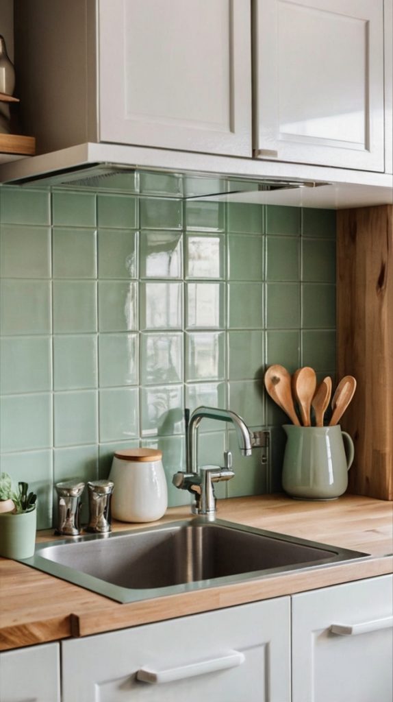
Not everyone wants bold color, and that’s where soft pastel green tiles shine. These whisper-quiet shades add just enough color to feel intentional without overwhelming your space. Think pistachio, celadon, or the palest sage – colors that suggest rather than shout.
I recently helped design a kitchen where soft green tiles created the perfect backdrop for colorful dishware and artwork. The tiles added personality without competing for attention. It’s like having the perfect supporting actor who makes everyone else look better.
Pastel greens work beautifully in smaller kitchens where darker colors might feel oppressive. They reflect light, making spaces feel larger and airier. Plus, they’re incredibly forgiving when it comes to matching with existing elements – these shades play nice with almost everything.
Glossy Hunter Green Tile Design
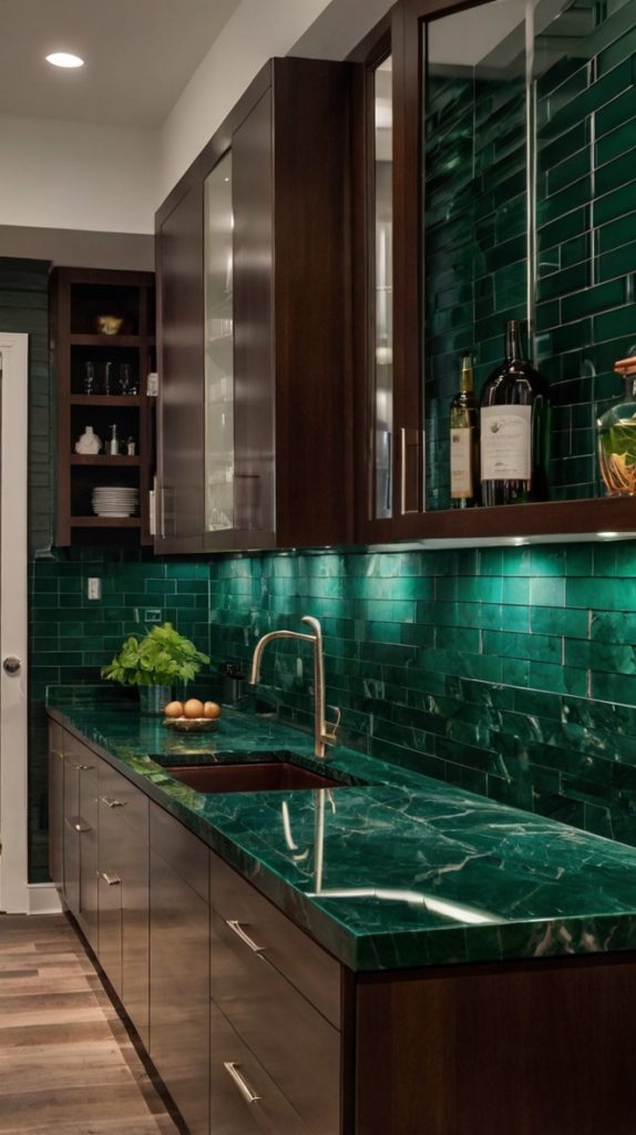
Hunter green glossy tiles bring serious sophistication to any kitchen. This deep, rich color feels both traditional and contemporary, making it perfect for homeowners who can’t quite decide on their style direction.
The glossy finish amplifies the color’s richness while creating beautiful light reflections throughout your kitchen. I installed these behind a client’s professional-grade range, and the combination of sleek appliances with glossy green tiles looked straight out of a luxury home magazine.
What makes hunter green particularly appealing is its versatility with metals. Brass hardware makes it feel warm and inviting. Stainless steel keeps things modern and clean. Even black metal fixtures work beautifully, creating a moody, dramatic atmosphere.
Making Hunter Green Work
- Balance with plenty of light (natural or artificial)
- Use white or light countertops to prevent darkness overload
- Consider using as an accent rather than full backsplash
- Add mirrors or metallic elements to enhance light reflection
Two-Tone Green and Neutral Kitchen Backsplash
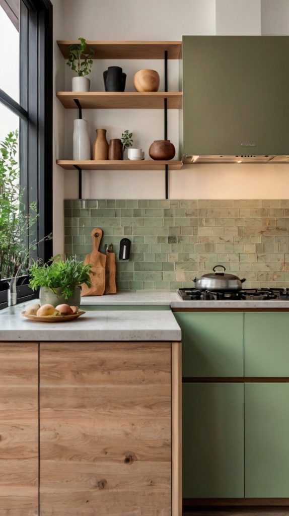
Why choose one when you can have two? Two-tone green and neutral backsplashes offer the best of both worlds – color and restraint, personality and versatility. This approach lets you incorporate green without full commitment.
I recently designed a backsplash using sage green and warm beige tiles in a geometric pattern. The result? A kitchen that feels both energetic and grounded. The neutral tiles prevent the green from overwhelming while the green prevents the neutral from boring everyone to tears.
Two-tone designs offer endless possibilities. Create patterns, borders, or random distributions. Use the neutral as your base with green accents, or flip it for more drama. The combination approach means you can incorporate bolder greens without fear of overdoing it.
Final Thoughts on Going Green
After exploring all these options, you might feel a bit overwhelmed (been there!). Here’s my advice: start by considering your kitchen’s natural light, your cabinet colors, and most importantly, what makes YOU happy. Green backsplashes aren’t just about following trends – they’re about creating a space where you actually want to spend time.
Remember, your backsplash doesn’t exist in isolation. Consider how it’ll work with your countertops, flooring, and overall kitchen vibe. Take samples home, live with them for a few days, see how they look at different times. That “perfect” green in the showroom might look completely different in your actual kitchen.
Whether you go bold with lime or keep it subtle with sage, green backsplashes bring life and energy to any kitchen. They connect your indoor space with nature, create visual interest without overwhelming, and honestly? They just make cooking more fun. After all, who doesn’t want to feel like they’re preparing meals in their own personal oasis?
The best part about choosing a green backsplash is that you really can’t go wrong. Each shade brings its own personality and charm. So go ahead, take the plunge into green. Your kitchen (and your mood while cooking) will thank you for it.
